Two by Two

Small is beautiful and particularly so in our world. We have a highly valued and enthusiastic team at Two by Two, working in an environment that encourages creativity, resourcefulness and self development.


Small also means personal. But not so small that we can't provide a dedicated team for each project, all with the right blend of skills.

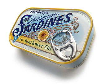
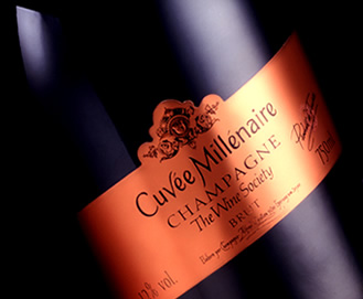
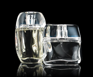
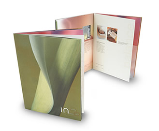
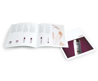
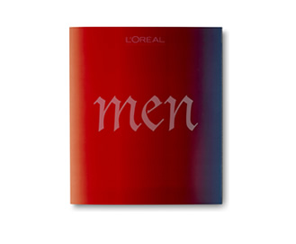
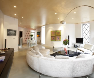
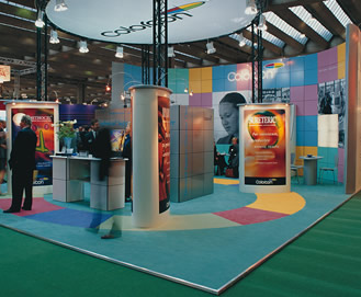
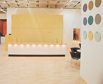
We combine fresh ideas with extensive experience of the design process to ensure our ideas translate into practical, workable, successful, and above all, innovative solutions.

We are passionate about design.

Formed ten years ago by Salvatore Cicero and Ashwin Shaw on the simple belief that the design process could be improved by fielding two key people to briefings, one of whom must have a design background. In this way, we harvest information and gain a more rounded interpretation of the brief. No Chinese whispers.

Both partners are actively involved in the planning, management and art direction of all projects. We offer a dedicated team and personal service for each client, combining a blend of fresh creative ideas, with extensive experience of the processes involved in translating visual ideas into practical workable solutions.

The success of our particular approach to design is demonstrated by the long lasting and close relationships that we build with our clients - culminating in products of which we are all proud.

Two by Two believe in the power of creativity and the craft of implementation. And it works.

map

Some of our clients...


Principal contacts

Ashwin Shaw
Salvatore Cicero
Nikki Wollheim


348 Goswell Road
London EC1V 7LQ

T: 020 7278 1122
F: 020 7278 1155

info@twobytwo.co.uk

A client since 1995. Two by Two have won several awards for packaging designed for Sainsbury's. Notable packaging ranges include Sainsbury's Organics, Christmas, Wines, Produce and Herbs.

design illustration

Innovators within the highly competitive skincare market, Purelogicol found its brand and product range being copied by inferior product formulation. Purelogicol came to Two by Two to develop a strategy and brand positioning for the range along with the redesign of their logo and packaging.

design illustration

Commissioned by the Wine Society to create a distinctive champagne label to mark the Millennium. Subtle detailing, colour and label shape form the basis for this very special collectors' item.

design illustration

Signature fragrance and body care range for men and women. Sculptured bottles were inspired by organic, fluid shapes fusing modern design with Nicole's own sense of style.

Awarded Best New Male Fragrance Packaging in the Fragrance Foundation Awards 2006.

design illustration

Relaunched in 1997 with Two by Two designed logotype and packaging. 2006 sees the relaunch of the Elemis Packaging range, the launch of 'Time for Men', revamped day-spa logo and literature.

design illustration

Brand and packaging design for Florence-based coffee producers. Well-known in Italy for producing coffee of distinction, Magnelli were keen to expand their market into other parts of Europe. Redesigning the brand offered the opportunity to reposition, update and rationalise a wide range of packaging, signage and support material.

design illustration

Development of a new corporate identity for this highly regarded firm of lawyers with offices across the South of England. The plus sign within the logotype is a positive and unusual way of linking the founder members' names.

design illustration

A unique company in many ways, one that aims to fulfill all the customers' needs. The 'Q' is extracted from a customised logotype, to reflect the Company's questioning approach. The 'Q' was then colour coded for subsidiaries to give a strong and impactful group presence.

design illustration

The identity for Saki Bar and Food Emporium fuses the traditional and the contemporary in a unique signature - Yose Moji calligraphy, created by eminent Japanese calligrapher Umon Tachibana and a contemporary logotype, specially developed both to complement the calligraphy and add a subtle twist.

design illustration

A project that combined many of our design disciplines - name generation, corporate identity, corporate collateral and interior design for this multi-award winning spa in Hampton Court. Shown is one of a suite of product brochures that invite the customer to sample the wide range of pampering treatments available to men and women.

design illustration

Analysis and review of skincare market, leading to the development and implementation of packaging and corporate collateral for this fledgling brand of anti-ageing skincare products. Photography styles and library of images established for POS, merchandising and lifestyle.

design illustration

A dynamic furniture company leading the way in product development. One of many brochures designed to showcase new products in an interesting and unusual way. Location photography used to great effect to surprise and engage the customer.

design illustration

Coffee table book and supporting promotional materials for men's hair salons. Designed to entice customers subtly into considering colour treatments. Included commissioning and illustrating articles on art, fashion, grooming and 'toys for boys', as well as creating product advertisements.

design illustration

Interior design for multi-award winning spa - including Salon of the Year and Best Spa for the past seven years. A relaxing sanctuary for both men and women. The concept is based on the idea of East meets West. The characteristic elements of Japanese simplicity, spirituality and hospitality together with Western modernity.

design illustration

Total refurbishment of this luxury flat in Mayfair, formerly Shirley Bassey's London base. Gutting and rebuilding bathroom, kitchen, living room and bedrooms.

design illustration

Total refurbishment of a four storey Piers Gough designed house in Smithfield, formerly the residence of Janet Street Porter. Gutting and rebuilding of entire premises, including four bedrooms, three bathrooms, kitchen and office.

design illustration

Design and organising build for 200 sq m exhibition stand in Frankfurt for Colorcon, a company supplying the pharmaceutical industries. Including large scale dynamic imagery and bespoke pods to ease transportation. A flexible system that could be adapted to fit different spaces with ease and efficiency.

design illustration

Design and organising build for 600 sq m exhibition stand for Orgatec in Cologne. Creation of a gallery space to showcase new products and new colours, in a style that paid homage to Damien Hirst and David Hockney. Including bar area and corporate video.

design illustration